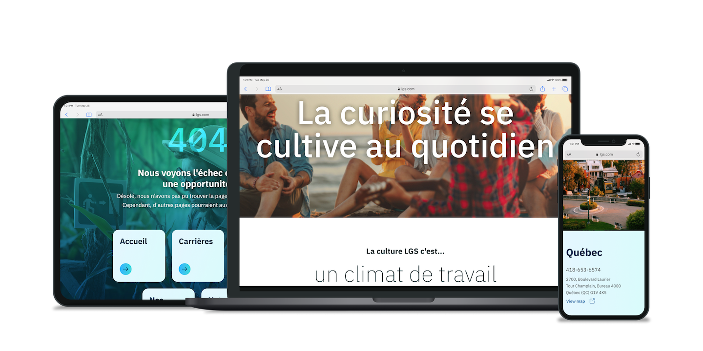

LGS, a sibling consulting firm acquired by IBM, transforms the cloud space for Québec clients by providing affordable bilingual consultants.
Rebranding in 2005, LGS partnered with iX to reinvent themselves with a new brand identity and shine on its own outside of the IBM family.

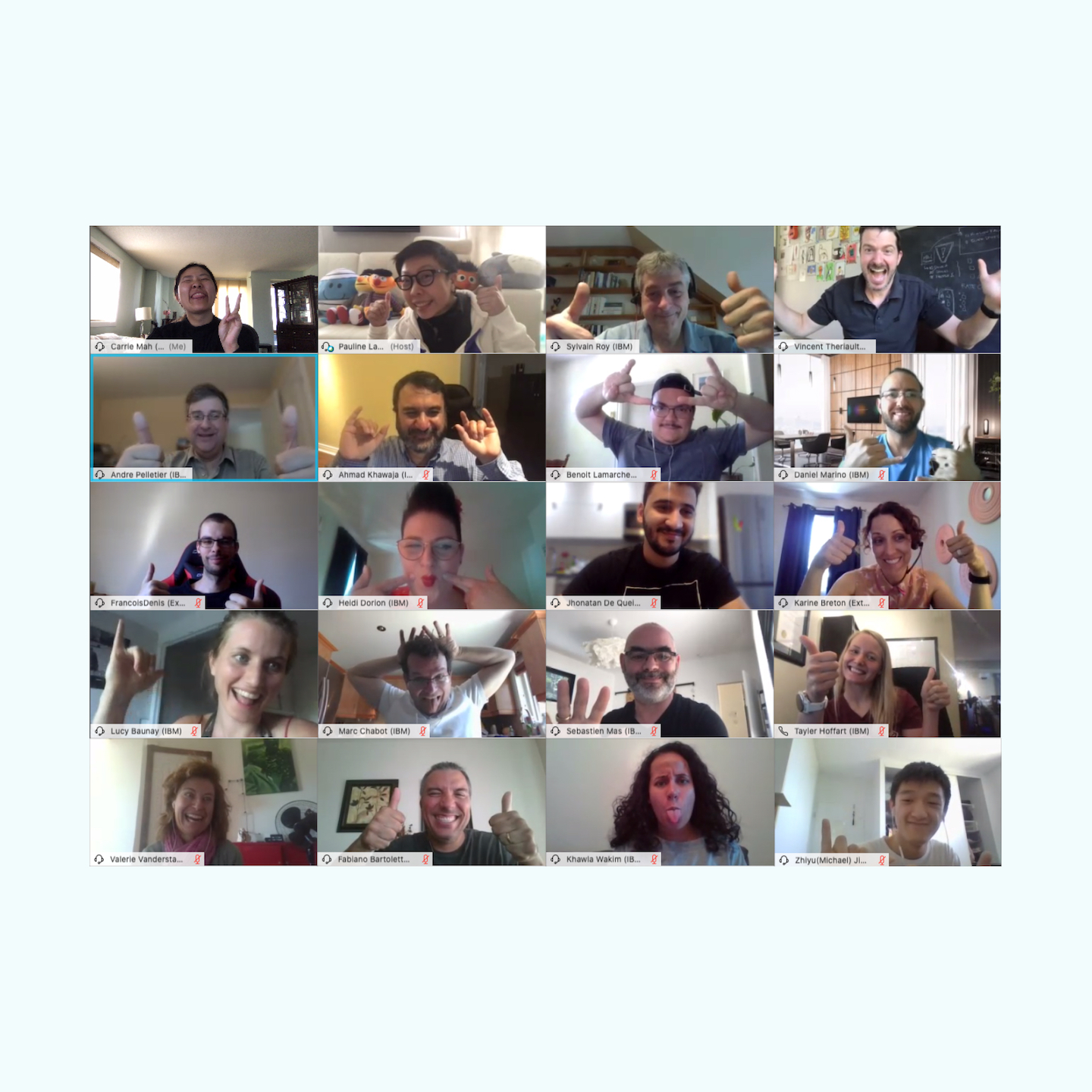
Participants from the design thinking workshop including the IBM iX team, LGS employees and executives.

How can LGS be recognized as a delivery-focused market leader, differentiate from other competitors in Quebec and be seen as an attractive workplace for professionals?

Understanding the current state allowed the team to identify how LGS is perceived by employees including why they would choose LGS compared to the parent company IBM. We leveraged what employees valued to reposition LGS.

Logos don’t represent brands. LGS required a new uplift visually but also strategically. We didn’t just deliver new brand assets and a website, but we also guided LGS to help understand who they are and what is their position in the market.
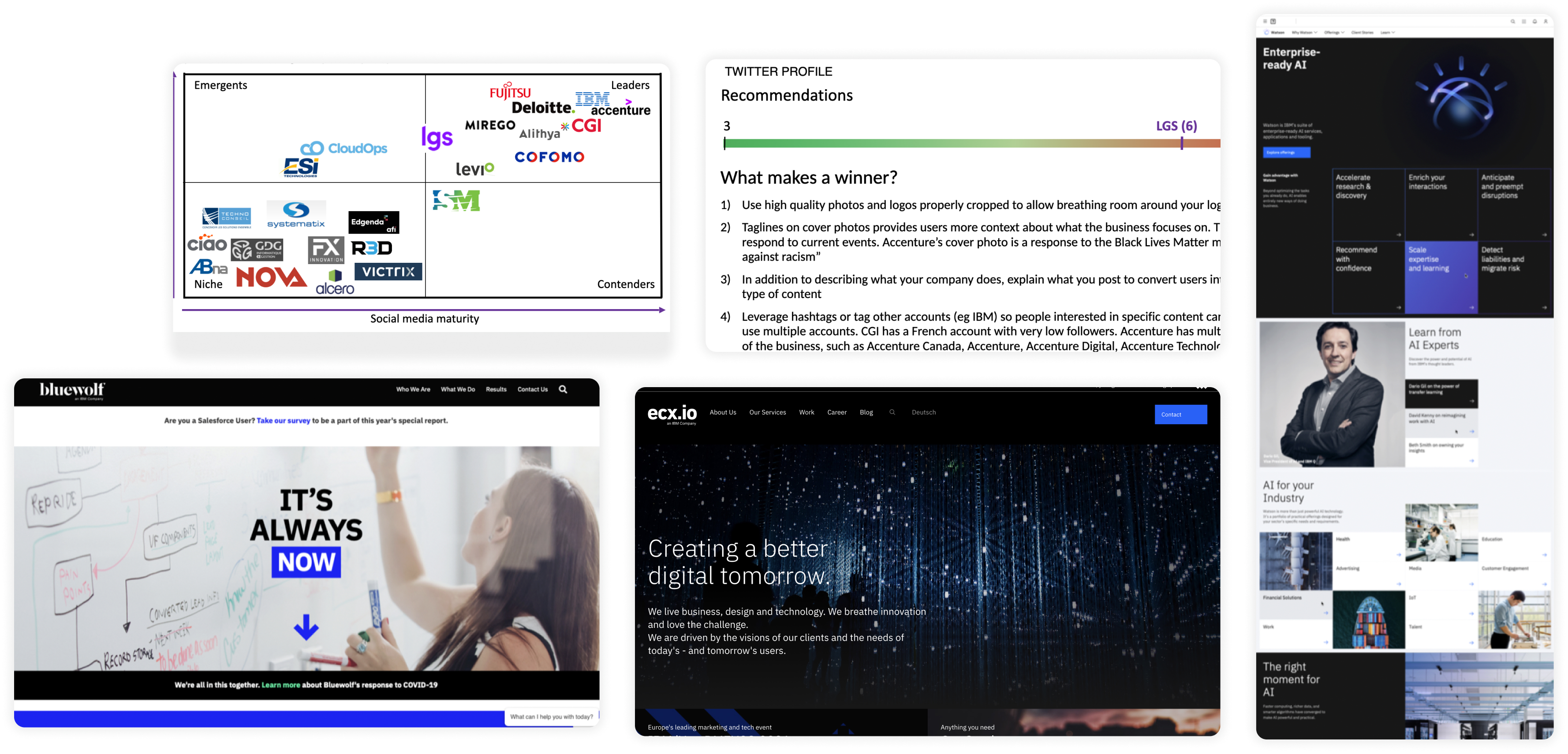
Prior to this project, a CX Lead worked on a benchmarking report to help LGS understand what their web presence looked like compared to other competitors. I helped identify their social media presence and recommend improvements to meet and exceed what their competitors were doing. LGS realized they needed to enhance their digital presence and planned to create a new website within a few months. As an IBM company, the IBM Carbon design system could be used as an accelerator and create visually stunning IBM-branded websites.
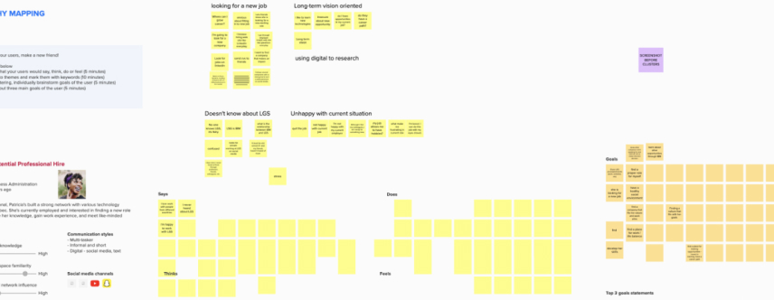
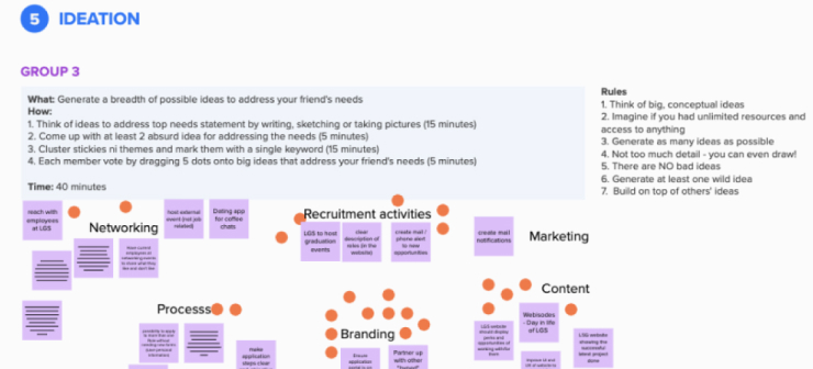
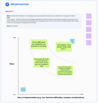
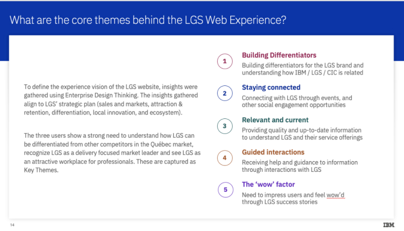
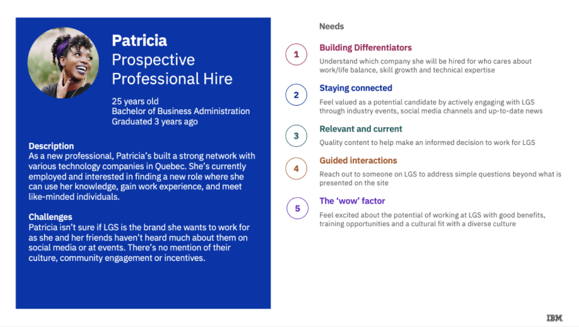
After initial conversations with LGS executives, I helped create user profiles based on potential website visitors. I created a Mural board and the team split into various groups based on language (French and English) and best representation of the user profiles. During the workshop, we heard what made LGS a great place to be and how their presence could be improved.
Laurent, the LGS employee, wants a clearer path for his career while leveraging IBM’s expansive training opportunities to expand his expertise.
Patricia, a prospective employee, values diversity and wants to learn new technologies and meet talent coming from different parts of the world.
Charles, the current client, is looking for a service provider who can digitally transform his cloud infrastructure with affordable rates.
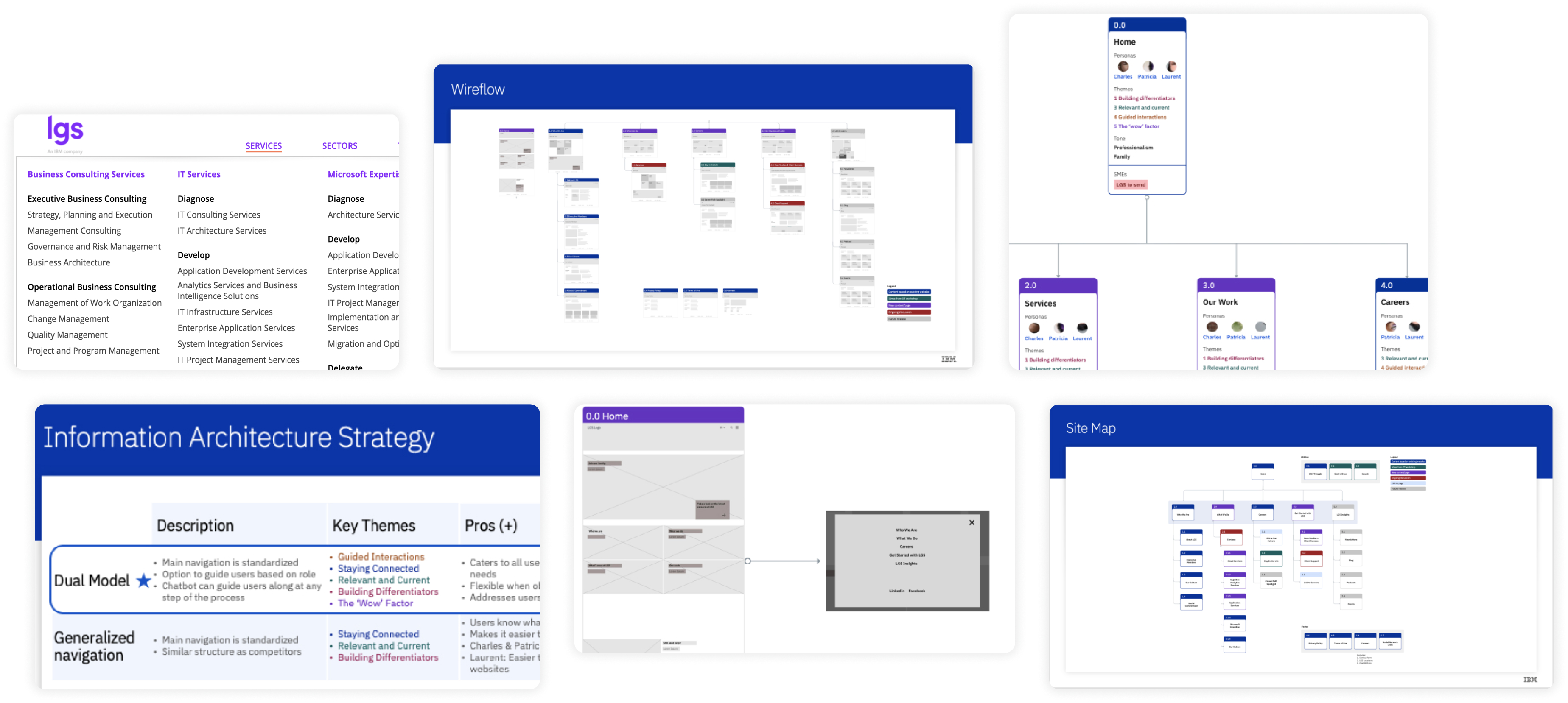
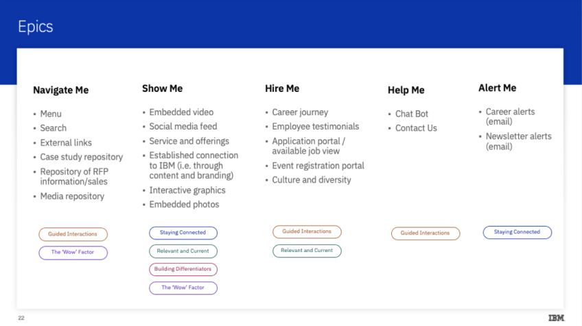
Setting up a strong foundation for the website required us to step back from diving into wireframes and recommend an overview of site navigation. After analyzing the current website’s complex architecture, we recommended an approach that merged traditional navigation menu items and a guided approach based on the user profiles.
We also heard a pain point of updating the website in the past was that LGS developers managed it on the side of their client work, resulting in an outdated site. The team recommended using a CMS for the Communications team to adopt and feel empowered to update.
Coordinating with the architect, I created wireflows to prepare CMS templates and connected the page’s content with the previous workshop’s user profiles, themes and brand personality.
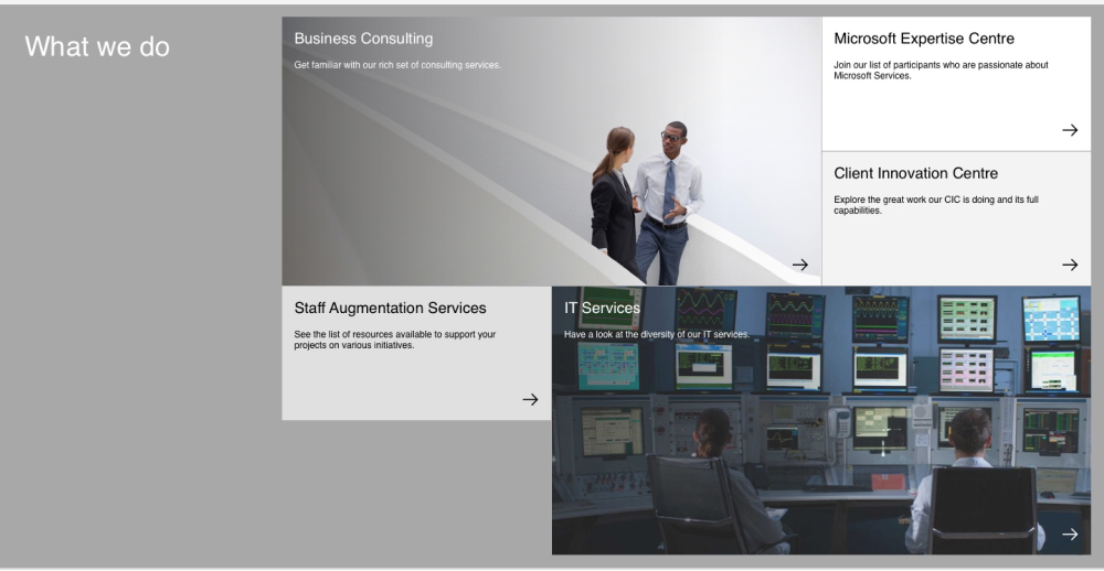
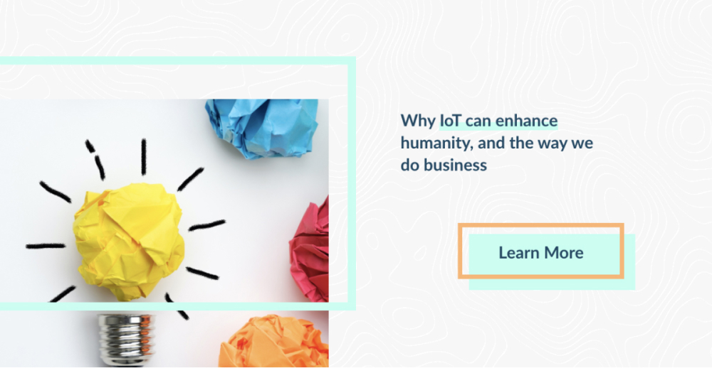
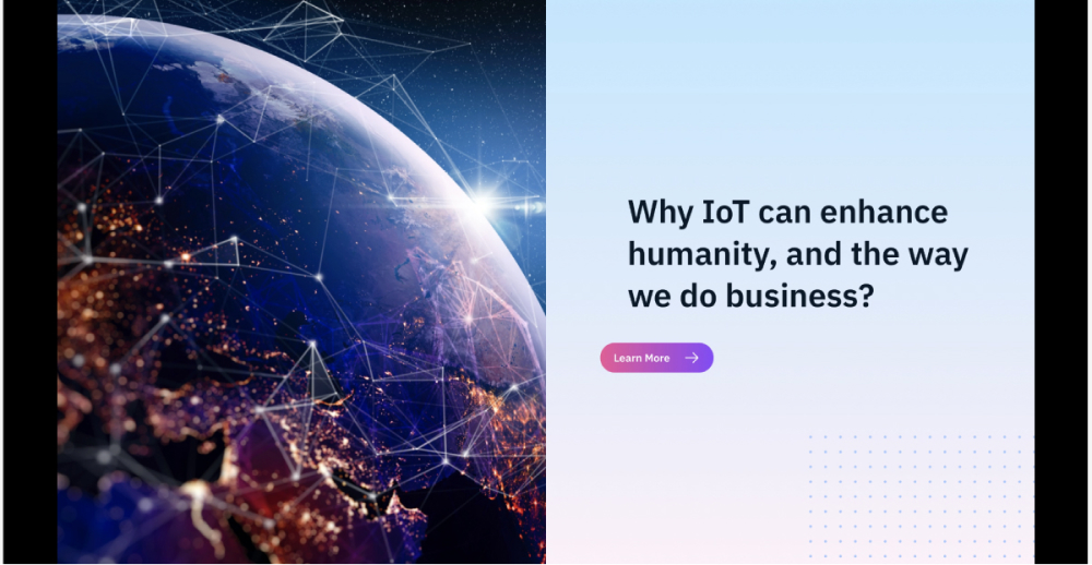
We started with the assumption to leverage the IBM Carbon Design System to fit the IBM branding standards. I searched IBM resources and connected with the IBM Design community to help a designer complete 7 visual design directions pushing Carbon Design. The client eventually realized they wanted a separate brand identity from IBM.
Three designers, including myself, worked on different visual design directions to demonstrate representations of conflicting feedback we’ve received. After seeing completely varied approaches, the client loved the work from one of the senior visual designers.
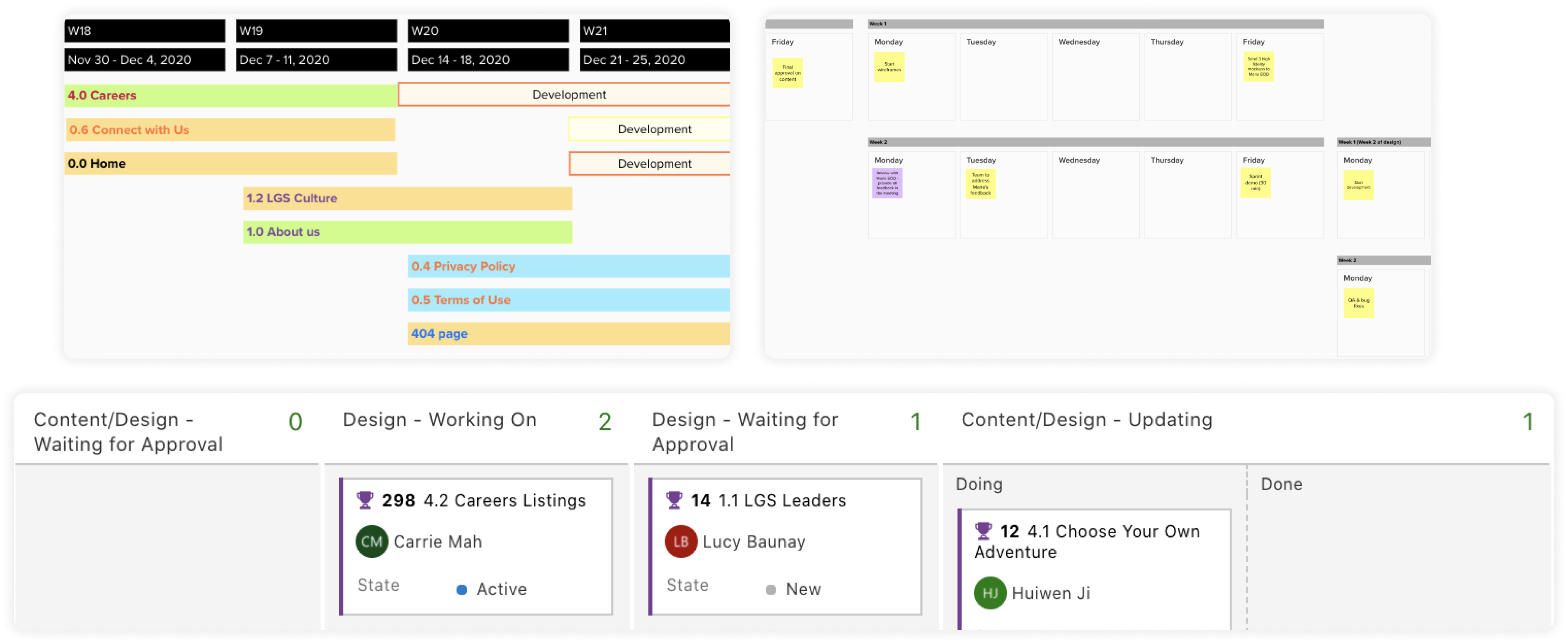
The visual design direction pivot shrunk website development from six months to three. With the foundation set, I coordinated with the Delivery Lead to plan a project schedule including setting deadlines for stakeholder feedback. I also worked with the Adobe Stock team as they had a partnership with IBM to find photographs based on the new visual design direction. This expedited initial research time spent searching for impactful images.
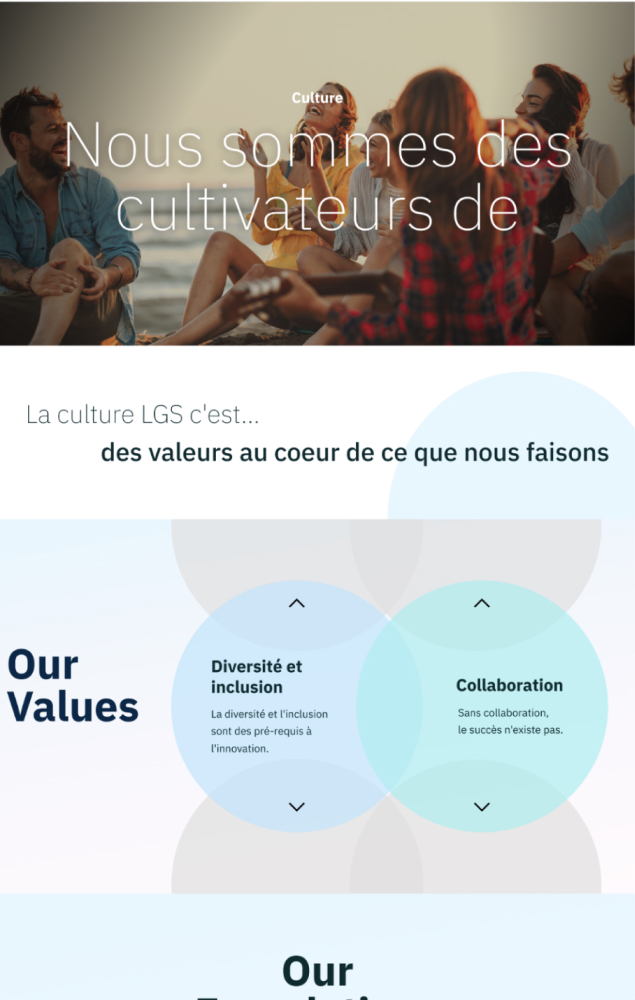
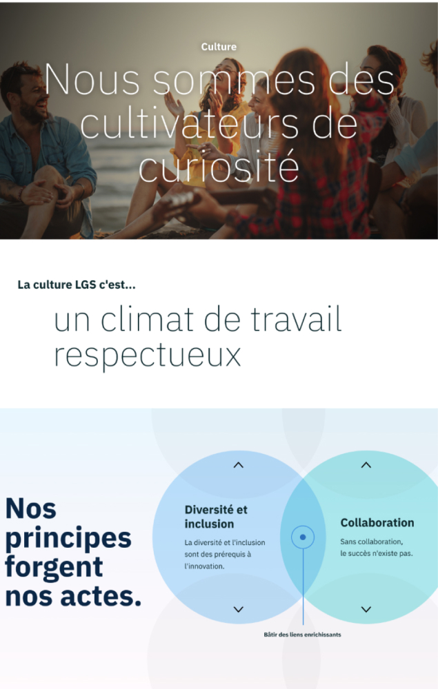
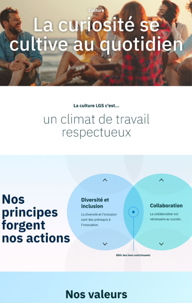
Working in an agile fashion, a senior designer and I recommended a workflow to accommodate for the tight deadline. We created wireframes alongside the content team, designed separate pages in parallel, demonstrated them to the client for initial feedback, provided one design update, received final approval and handed them to developers. The workflow was quickly adopted, albeit minor tweaks were added over the three months.
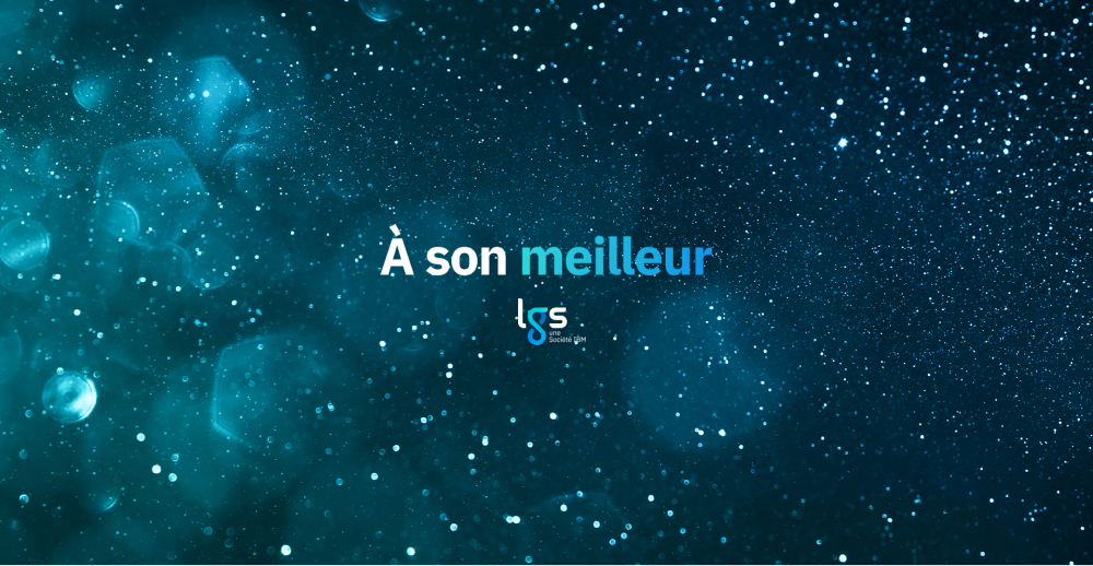
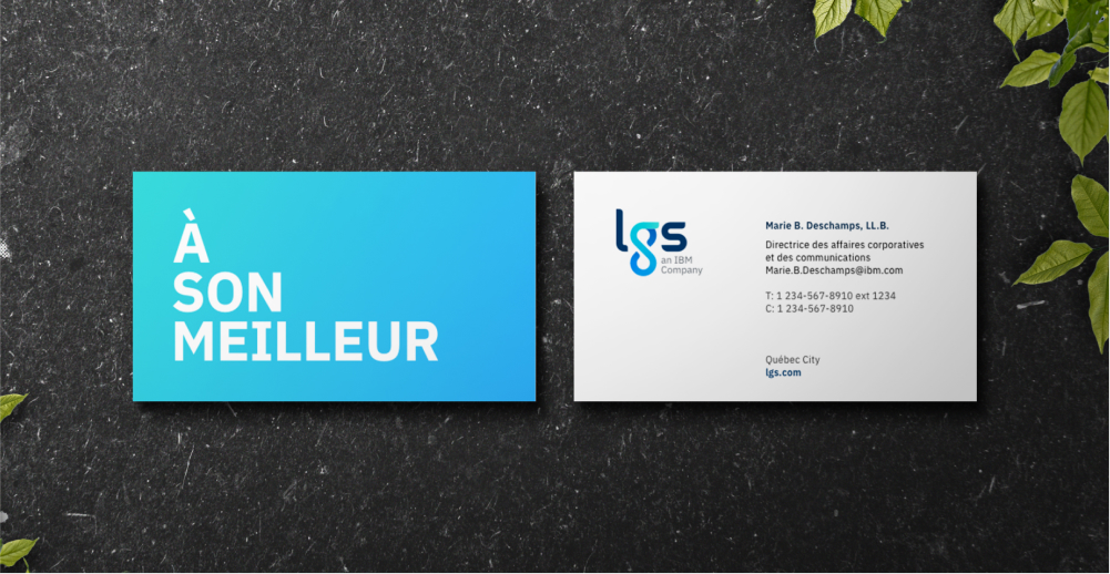
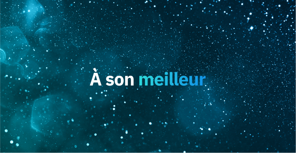
As the bulk of the designs were approved, the client team also asked for marketing assets to accompany the new rebrand. Leveraging the logo and tagline assets, I worked on templates, business card designs and social media cover photos following the new brand standards.

The initial team working on this project started it as a small side project. Treating this opportunity like any other client engagement by delivering quality results led to become a fully-funded rebrand initiative incorporating employee feedback, a refreshed brand and updated digital presence.

Leveraging Figma’s features, the designer and I aimed to minimize complexity for developers. We reused many responsive-friendly design components, created page templates and thoroughly annotated designs with code examples demonstrating animation behaviour.

By guiding LGS through employee-focused workshops, a rebranding initiative, a website redesign and recommendations for marketing materials, we helped the client stakeholder, the Director of Communications, unveil the new LGS brand to employees and the digital space.
As a result, employees and executives at IBM and LGS provided glowing reviews during an internal launch. We also helped increase Linkedin and Facebook followers by 30%+ and engagements by 50%+.

The projects you learn from the most are the ones that pivot often. Rebranding a company is no trivial feat and involves many perspectives and voices. It would be ideal to have a brand defined before creating a website, so we had two parallel teams with constant collaboration and crossover.

Our team needed to guide the client on best website design and rebranding practices. Instead of explaining it, we demonstrated a few options visually and found strategies to minimize rework and recommend options balancing best practices and client’s needs.

Throughout the various phases of the project, many team members kept entering and leaving the team. As this started out as a side project, I anticipated frequent onboarding. Since this project was done completely remotely, I leveraged digital communication tools to document key learnings and milestones.

Discovering more about IBM and LGS uncovered additional cultural differences and Quebec pride that the stakeholders wanted to highlight in the rebrand. Working with stakeholders more comfortable speaking in French allowed our team to leverage different strengths and made collaboration diverse and inclusive.
I've had the pleasure of working with talented folks. Check out what they had to say about working with me.


Carrie demonstrated very impressive and quality work to a successful project. She took a lot of initiatives needed that brought value to the team - and helped out to build the relationship with our client.
I really valued her attention to mastering her visual designer skill. The work she delivered has been top notch, but what differentiates her is how she understood the complexity of the client organization, and how she was able to learn and execute with incredible speed and quality.


Carrie has a fantastic sense of optimism, even when the road ahead presents her with hurdles. There were times when the client presented the team with many challenging pieces of feedback and questioning our whole design direction. Carrie's 'can do' attitude was a driving factor in the teams’ high morale throughout the engagement.
Her attention to detail in organizing the design teams daily, weekly and project wide needs helped keep the team on track. Overall, it was a blast working with Carrie, I loved her energy and willingness to learn just about ANYTHING!


From the beginning, Carrie has been very available at all steps. No matter what requests or questions I had, she would find me the answer or lead me to the right place. Her good humor and quick-wittedness will charm you, in addition to her efficiency in meeting our business needs.


I had a great time working with Carrie. This was a challenging project [that] required a lot of skill in trying to understand clients needs, a lot of trial and error and a lot of rework. This can usually be a frustrating experience, yet Carrie always came to meetings with an amazing attitude that made it easier for everyone.
As a developer, I found it very easy working with her. She always supported the development team, responding to any questions we had right away and gave us very clear designs that made our work so much easier.


It's been a pleasure working with Carrie, even though the project has been quite rocky. She is always keen to learn and get information, and her work ethic is unparalleled. She is very capable of any work that is put in front of her, and if she didn’t know the answer... she goes out and seeks it from others. It is a very humble skill to have, and I respect that.
Carrie has shown leadership on this project, and I have no doubt that she will be successful in any engagement she is put on.